Project #1
A better
push!

Improving the UX of Push Notification Preferences with a complete UI uplift
📱 IOS, Android
📆 2024

The
problem
While our app has a loyal user base, engagement levels were dropping. Users often missed important deadlines and notifications due to findability and usability issues.
The goal was to implement a new push notification system that would help the user experience.
This part of the app was completely abandoned for years. The screens were dated, the experience was messy, inconsistent and it was everything but user-friendly. Data showed, that users struggled to get the task done: apply their push notification preferences to one or multiple accounts.

Timeline
📍1
Kick-off : what are we
dealing with?
First, we wanted to determine how Card Members (CMs) expect to manage push notification preferences across single and multiple cards.
We conducted a rapid user lab with 6 users. I was especially curious to test the discoverability and usability of the current experience in general, since the UI and UX were so old. As expected, users weren’t too happy.
After understanding the user needs and frustrations, my goal was to apply findings from the study to help ensure that push notification preferences are discoverable, clearly understood, and meet the expectations of CMs.

📍2
Design Thinking
Workshop: how are we are
going to deal with it?
Let’s get everyone on the same page and create a new improved journey based on user insights and business goals


📍3
Starting from zero:
modernising for good
As you might have guessed, everything was living in Sketch at that point, it’s a nearly 180 year old company after all, so my job included a complete rebuilt in Figma 🫣
Autolayout!!!! Finally!!!!
📍4
Design and collab:
keep it consistent
After prioritising all the pain points, the work has begun. I worked through different scenarios in happy and unhappy paths, redesigning all flows in Figma, while collaborating with Product, Devs and UX writers on a daily basis.
📍5
Iterrate:
check-in with users
Next steps: plan a rapid user test, to check we are on the right path 😇


Before
👎 1. Dated, inconsistent UI
👎 2. Confusing “Apply to Accounts” screen
👎 3. Lack of clarity after applying changes
👎 4. Inconsistent UX copy
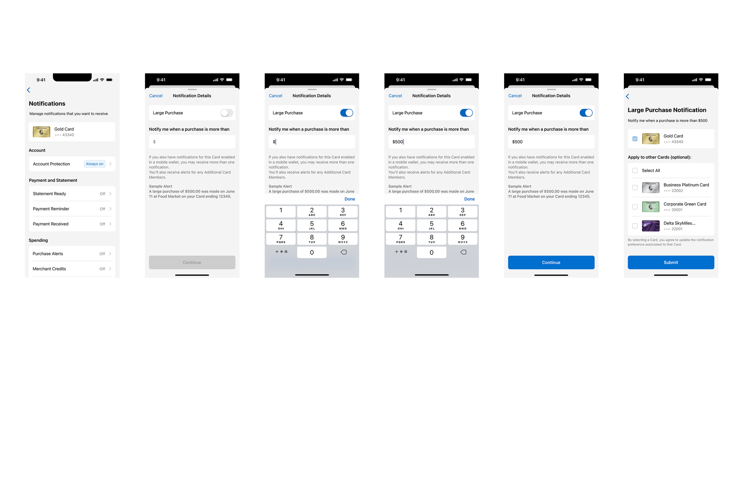
and After
✅ 1. Complete UI uplift, based on the latest NDL guidelines
✅ 2. Redesigned “Apply” screen based user feedback
✅ 3. Review UX copy for better understanding and navigation
Some
Highlights
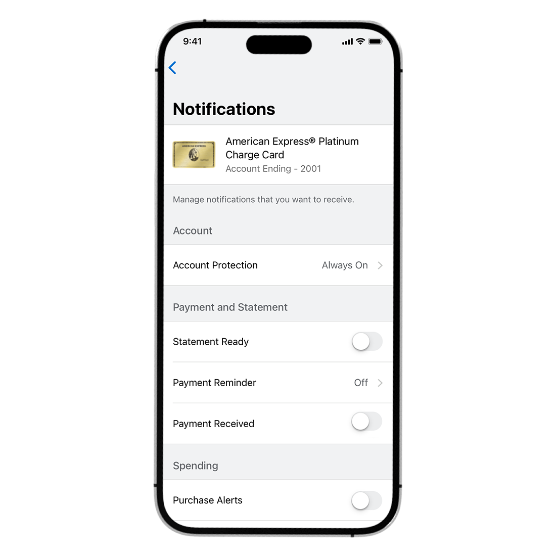
Complete UI uplift


Improved experience
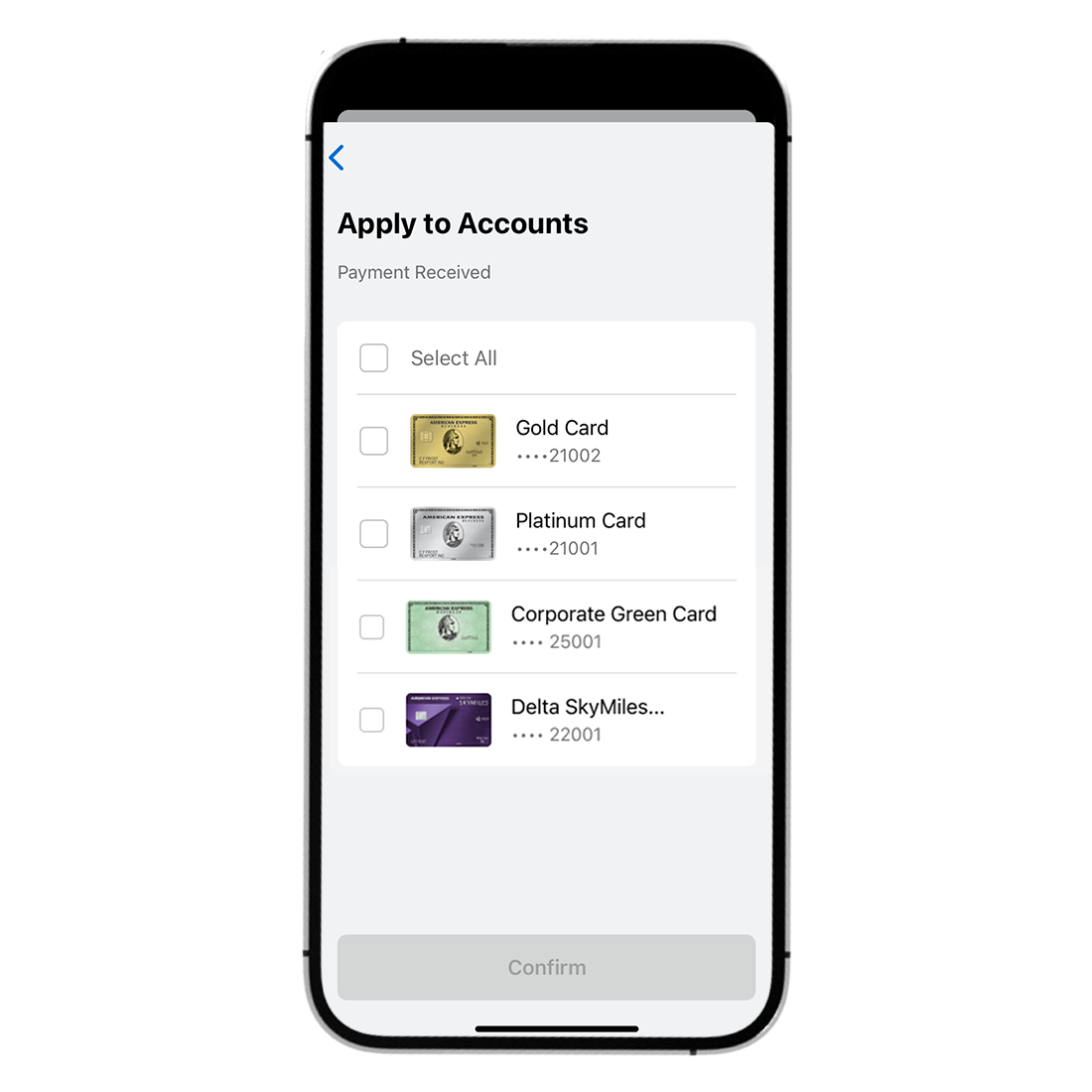
on Apply screen

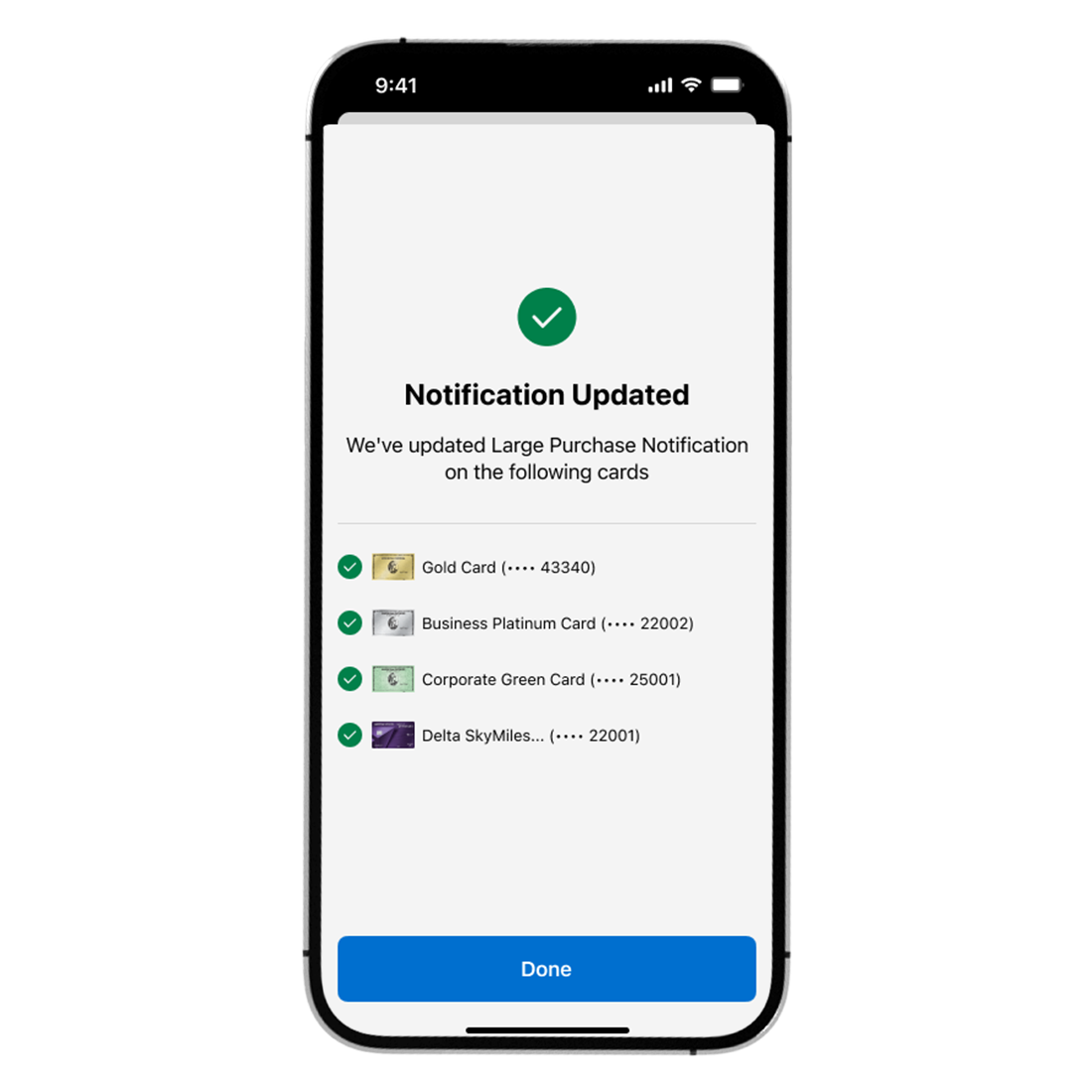

Confirmation screen
Measuring success
🦄 Drive Push Enrollments on the Mobile App
🦄 Closing the gap of 41% of Multi-Card CM’s preferences enrolled for more than 1 Card to 70% of Overall Preferences enrolled
🦄 Reduce overall SMS costs
🦄 Increase Customer Satisfaction Score (CSAT) and Digital Engagement
What’s next
⭐️ Launch the same Apply All and Confirmation Screens for Android in the 7.14 App release
⭐️ Extend Apply All capability to Push Preferences that were out of scope for MVP
⭐️ Discovery and internationalisation of more Push Preferences and capabilities for 2025
Project #2
Call Centre
Magic

Amex’s internal knowledge tool for Call Centre.
Happy call center, happy card member, happy business! Easy-peasy lemon squeezy, or maybe not? 🍋
💻 Desktop
📆 2023
The
product
Our Colleague Help Center (CHC) is an internal knowledge system tool designed for call centre. This tool provides our front-line colleagues with product and process knowledge through their onboarding journey and during servicing calls.
Its vision is to ensure Customer Help Professionals (CCPs) and customers are well informed through a best-in-class integrated knowledge & learning journey, with a single source of truth.
The
users
CHC must meet the needs of 35,000 users across 9+ lines of business. In this project, our users are our colleagues, whose biggest goal is to solve the card members’ queries fast and efficiently, to meet call handling time and success rate expectations.
Owning
the tool
This is me on my way to a Call Listening session, where we get to experience what our users are dealing with

My role
📌 Create high-quality colleague learning and knowledge experience for users
📌 Structure content in a customer centric way
📌 Constantly respond to user feedback with iterative feature development
📌 Always advocate for UX methods and techniques during the design of products and services to improve overall business performance
📌 Manage stakeholders and partners frequently
📌 Raise awareness about accessibility standards and facilitate a specific, measurable and achievable plans
Features
I worked on
Readability research x Search result page redesign x Bookmark categorisation x Filtered by bookmarked articles x Recent queries x Home page redesign x Feedback journey x Subscriptions x AI Chatbot

#1
Quick
Answers
In September 2014 Google introduced a new method of presenting content relevant to “how to…” or “what is…” queries, called “Quick Answers.”
With this feature, Google takes snippets of content from specific webpages and features it in the “Quick Answers” box just above the first organic result in the search engine results page (SERP), and just below the paid listings. In addition to the content, Quick Answers also provides a link to the source page.

Problem
In our knowledge system tool users cannot obtain a quick response with a specific piece of information, without using the navigation or search alongside list and filter option to find a piece of information.
Goals
For faster response to cardmember queries 🏃♂️
1# Quicker ways to locate telephone number rather than reading a full article
2# Quick and easy way to digest information on search results page
3# Enhanced user functionality and Increased satisfaction
4# Improve Call Handling Time (CHT) and First Contact Resolution (FCR)
Secondary
research


Sketches


Mid-Fi
Prototype
🎉 …and users were delighted 🎉
user quote
“we will save so
much time!"
#2

Usability
Toggle-switch drama
option 1 (the only option until the first test)
Toggle - switch
Two mutually exclusive options. Have a default value the “only bookmarked articles”
option 2
Stand - alone checkbox
For a single option that the user can select on or unselect, it can show number of options
Usability testing
Users didn’t understand what happens when they turn on ‘Bookmarked articles"‘ toggle.
It also raised some labelling problem. If the default is off, will still show bookmarked articles in result?

user quote
“I have no idea
what just
happened”

Stand-alone checkbox
🎉 Passed usability testing 🎉
#3

That led me discover problems with the first iteration and helped optimise a better experience for our users
User flow
🤯

🤓

Some nice
data
#4
Measures of success
Effectiveness
Efficiency
Satisfaction

