✦ Project #1 ✦
AMEX’S FIRST MESSAGE CENTRE

User-centric Message Centre that enables customers to view critical updates, securely communicate, retrieve marketing offers, and manage multi-product messages - all in one centralised location.
💻 Web 📱 IOS, Android 📆 2025 ⏳ 6+ months 👨💻 Lead Designer

✦ OPPORTUNITY ✦
Our data revealed that only 2% of card members were actively engaging with the current Message Centre - a clear signal that the existing experience was falling short!
Further investigation pointed to poor findability and a lack of meaningful features as key barriers to engagement. This low usage presented a critical opportunity to rethink the Message Centre from the ground up. With new support from Marketing, we were not only positioned to improve the core functionality and visibility of the Message Centre but also to introduce a new stream of value by integrating relevant Marketing messages.
This dual-purpose redesign aimed to transform the Message Centre into a more discoverable, useful, and engaging hub for card members.
✷ Under 2 % of engagement 😱 ✷ Support from Marketing ✷ Dual opportunity
✦ DISCOVERY ✦
🔎 Stakeholder Interviews
We conducted in-depth sessions with internal teams (Servicing, Marketing, Tech and Legal) to uncover both customer pain points and business opportunities. Here are the business goals:
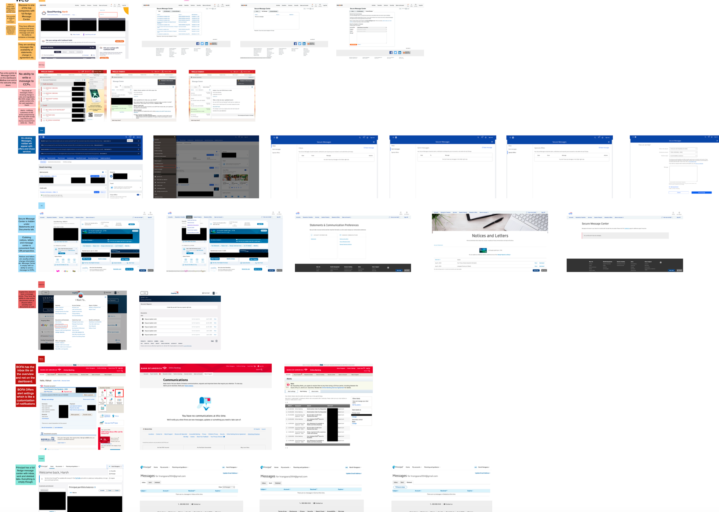
🔎 Comparator and Competitive Analysis
After understanding the user and business needs, I wanted to study message centres from comparator and competitors. Here are the key takeaways in a nutshell after reviewing what works well ✅ and what falls short ❌:
✷ Barclays stands out as the only major UK bank offering a full secure, persistent Web Message Centre within online login systems, capable of threaded conversations and attachment support.
✷ Others rely heavily on transient chat—supporters should treat chat more like help sessions than inbox conversations; messages aren’t stored beyond the active session.
✷ Lack of persistence and history means less control for users—no message archive, inability to search past support discussions, or link account alerts to message threads.
✷ Customers who don’t use mobile banking are disadvantaged—with text alerts phased out at Santander and First Direct, web-only access is still under-equipped.
✷ Regulatory compliance demands traceability in messaging—any Web Message Centre must include archiving, audit data, and secure encrypted storage.
💡 UX Principles Defined
To guide the redesign, we aligned on MVP:
✧ ✧ ✧

✧ ✧ ✧
🤖 Time to protoptye
We created low- and high-fidelity prototypes covering:
Home screen with message preview + product indicators
Multi-account switcher for cards, checking, HYSA, etc.
Filters by category: offers, fraud, payment, documents, servicing
Search functionality
Bi-directional thread view (Chat-like)
Actionable offers (PZN-driven) with retrievability
Attachment upload UI for document submission

✅ Logical to separate different message types
Most CMs preferred separation between Priority and Promotion messages to help emphasise important or time sensitive messages and maintain their focus.
✅ Expiration day and card info
Even before seeing the alternative label stimuli, some CMs expressed a desire for more specific labels. Whether they felt they needed them or not, all CMs felt the more specific labels increased clarity and supported more informed navigation.
❌ Labels
Labels were initially visually interesting to some, ultimately, most found it too difficult or overwhelming to sort through the different messages when they were displayed together.
✷ Reduce call volume to CCPs*
✷ Enable PZN-driven marketing and cross-sell
✷ Create scalable infrastructure for future Amex products
✷ Centralise customer communications
✷ Rebrand SMC to “Message Centre” to align with a modern voice
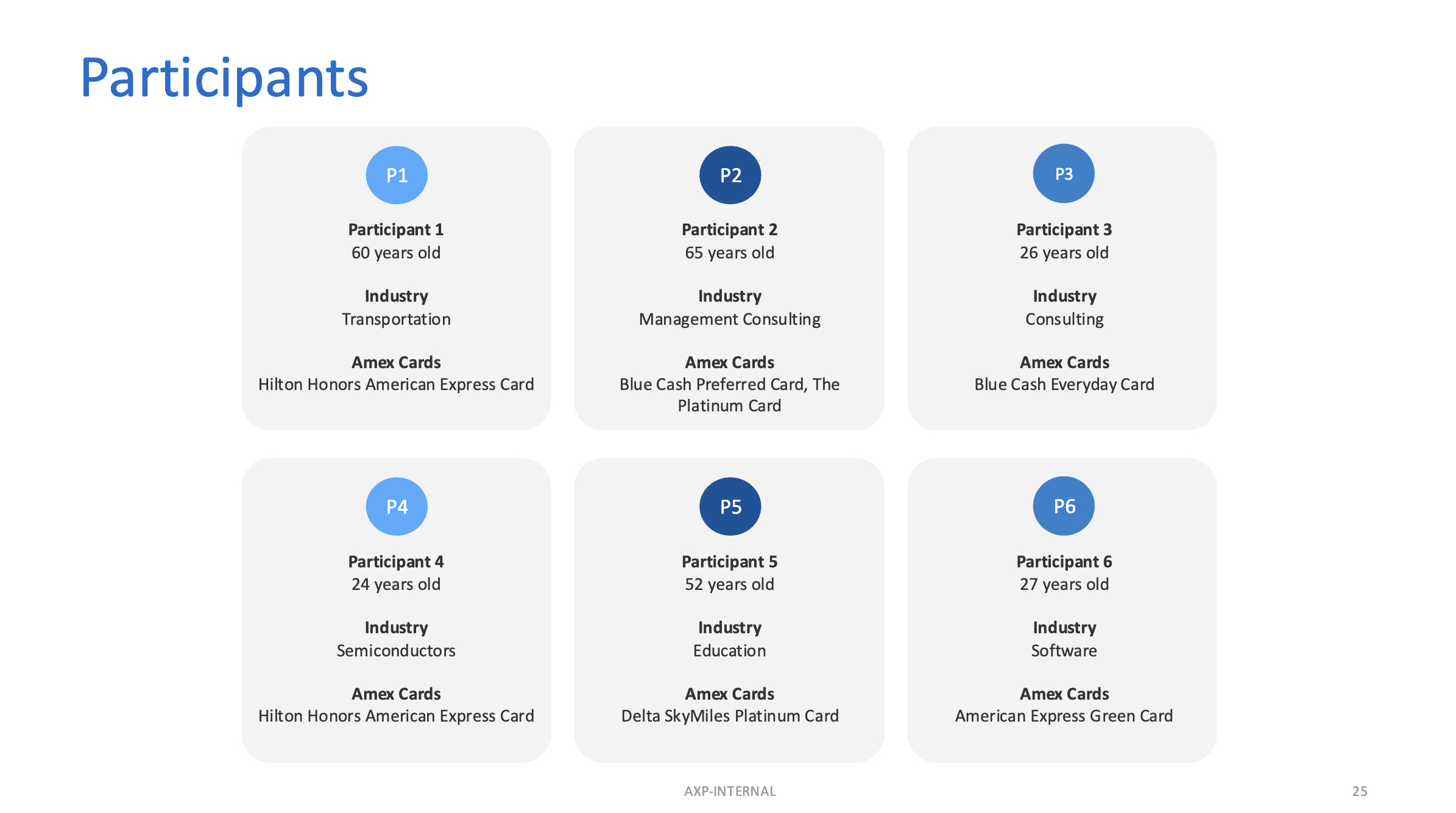
🔎 User Interviews
We spoke with Amex Card Members (CMs) across personal, business, and banking segments, some quotes from interviews:

💬 Do we have to say ‘Secure’ at all?
The team aligned on removing the word “Secure” from “Message Centre.” Since security is a core expectation of our product, explicitly stating it in the name felt redundant. A secure experience should be a given, not a feature we need to call out.
✷ “I didn’t know where to look for an old message.”
✷ “I don’t want to call customer support, I’d rather message.”
✷ “I dismissed an offer but now I want it back. Where is it?”
✷ “I use multiple Amex products and want a unified message experience.”
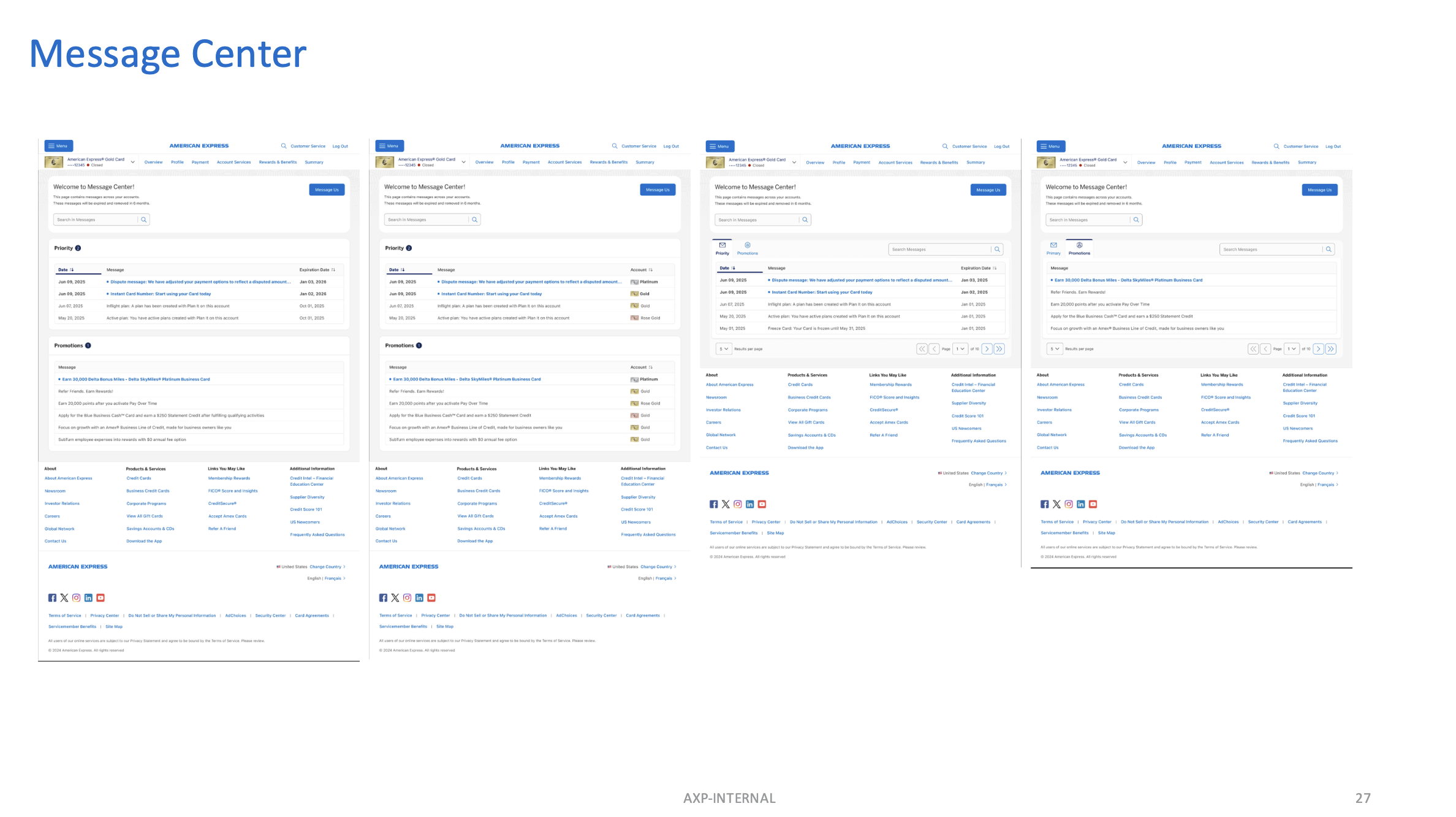
🎨 Mid-Fidelity designs
Amex card members (CMs) lack a centralized, discoverable, and secure platform for viewing critical account messages and offers across products. The existing SMC fails to meet expectations for multi-account management, offer retrievability, bi-directional support communication, and discoverability.
🎤 User Interviews
Amex card members (CMs) lack a centralized, discoverable, and secure platform for viewing critical account messages and offers across products. The existing SMC fails to meet expectations for multi-account management, offer retrievability, bi-directional support communication, and discoverability.
✷ Security (Implied) Design must feel secure without stating it.
✷ Organisation Messages should be sorted, grouped, and easy to navigate.
✷ Discoverability Message Centre should be easy to locate and use.
✷ Max State Clear guidelines on message types, visibility, and retention.
✦ NAME 🤌 ✦
✦ QUICK RESEARCH ✦
✦ DEFINE ✦
✦ RAPID TEST ✦
✦ LEARNING SUMMARY ✦
✦ DEVELOP ✦
design iterrations
✧
design iterrations ✧
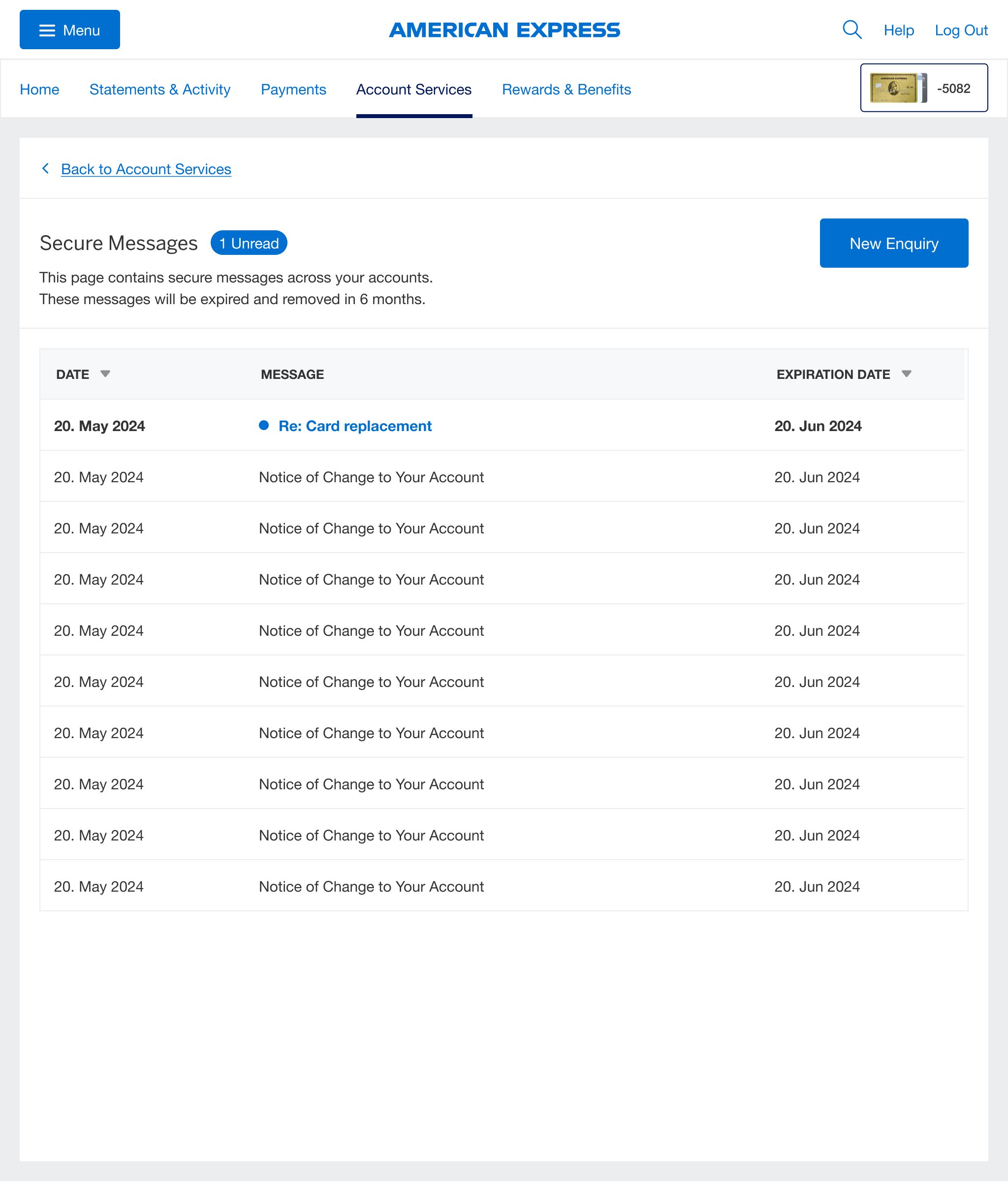
BEFORE
👎 Not consistent with industry standards
👎 Gaps through comparative analysis: lack of features, poor findability
👎 Dated UI
👎 Missed opportunities: user satisfaction or drive revenue
AFTER
👍 Organised: High priority messages top, marketing messages bottom
👍 Identifiable messages
👍 Secure feel through xxxxxxxxxxxxx
💪 Further Enhancements / MVP +
✷ Unified Navigation Entry Points
✷ Expand Messaging to cover Banking CMs
✷ Attachments in conversation threads
✷ Expand notifications to appear on Overview & Dashboard
✷ “Retrieve Offer” flow built into dismissed messages
💙 Accessibility & Security
✷ WCAG 2.2 compliance
✷ Encrypted data-at-rest and in-transit
✷ MFA enforced for message access on email deep link
✷ “Secure-by-design” principles integrated into color, typography, and layout (for example, no use of the word “Secure”)
🤝 What went well: Despite the complexity of multiple stakeholders, we aligned on key priorities early, which helped keep core development on track.
🌍 What we learned: Working across time zones highlighted the need for more asynchronous communication, like written updates proved more reliable than live syncs.
🛠️ What could be improved: Unclear message behaviours and inconsistent requirements from Marketing caused rework and slowed testing.
📌 Action items: Consolidate stakeholder input before sprint planning, establish clearer documentation for message flows, and agree on async check-in windows across time zones.
✦ RETROSPECTIVE ✦
✦ NEXT STEPS ✦
✷ 25%+ reduction in servicing call volume on offer queries & document confirmations
✷ +30% CTR on email-based PZN messages
✷ 80% discoverability score in post-launch user survey
✷ 20% lift in message center usage by banking product holders
End of ✦ Project #1 ✦
✦ PLANNED OUTCOME ✦
✦ Project #2 ✦
PUSH NOTIFICATIONS UPLIFT

Solving findability and usability issues to boost user engagement with a complete UI uplift
📱 IOS, Android 📆 2024 ⏳ 3 months 👨💻 Lead Designer
✦ BRIEF ✦
Despite a loyal user base, our app was facing a steep decline in engagement. Why? Users were missing critical notifications and deadlines, affecting both satisfaction and trust.
Digging into the issue, we discovered the root cause: a dated, fragmented push notification system that hadn’t been touched in years. It was riddled with usability issues. Users found it hard to navigate, nearly impossible to customise across multiple accounts, and - most critically - hard to even find.
✦ RESEARCH ✦
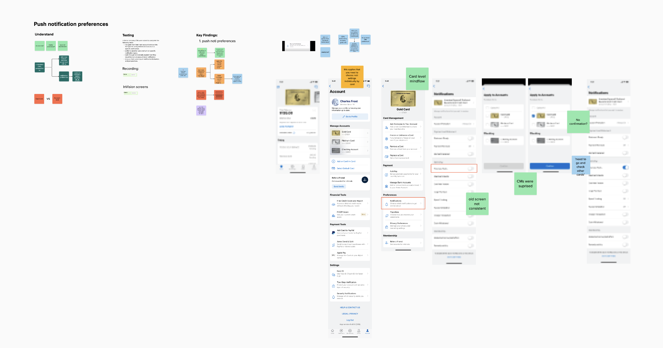
🔎 User Interviews
we conducted a rapid user lab with 6 Card Members (CMs) to evaluate the discoverability and usability of the current system. The findings were clear (and brutal 🥸):

🤝 Design Goals
✷ Drive meaningful engagement
✷ Enable action from within notifications
✷ Clarify purpose (transactional vs promotional)
✷ Improve readability and hierarchy
✷ Maintain accessibility standards
🎨 Much-Needed Overhaul
The legacy designs were stuck in Sketch. I led a complete rebuild of the experience in Figma.
This wasn’t just a visual update. It was a foundational re-architecture of the interaction model, information hierarchy, and design system usage. Key focuses included:
✷ Users couldn’t locate notifications easily
✷ Once found, the interface was confusing and outdated
✷ Managing preferences across multiple cards was unclear and cumbersome
✷ The language used was inconsistent and often unclear

🤝 How Might We
“How might we create a Notification experience that surfaces relevant, timely, and actionable information while aligning with Amex’s premium digital brand?”
✷ A modern, mobile-friendly UI with clear grouping
✷ Simplified Notification setting process
✷ Improved accessibility and clear feedback states
✦ WORKSHOP ✦
✦ DESIGN ✦
✷ Engagement was dropping.
✷ Users were missing critical updates.
✷ The notification preferences screen was outdated, confusing, and barely usable
🏆 Objective
To redesign the Notification screen to increase engagement, usability, and consistency with the Amex brand. The goal was to make notifications more actionable, user-centric, and visually aligned with Amex’s premium digital ecosystem.
🧨 Problem Statement
To redesign the Notification screen to increase engagement, usability, and consistency with the Amex brand. The goal was to make notifications more actionable, user-centric, and visually aligned with Amex’s premium digital ecosystem.
before & after
✧
before & after ✧

BEFORE
👎 1. Dated, inconsistent UI
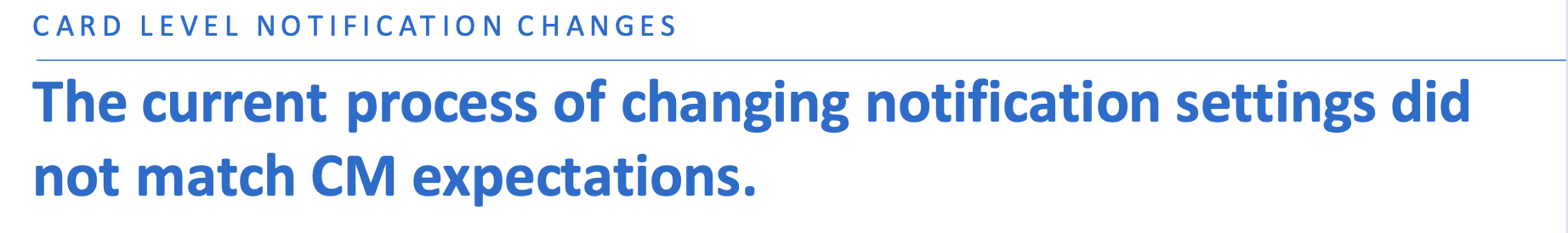
👎 2. Confusing “Apply to Accounts” screen
👎 3. Lack of clarity after applying changes
👎 4. Inconsistent UX copy
AFTER
✅ 1. Complete UI uplift, based on the latest NDL guidelines
✅ 2. Redesigned “Apply” screen based user feedback
✅ 3. Review UX copy for better understanding and navigation

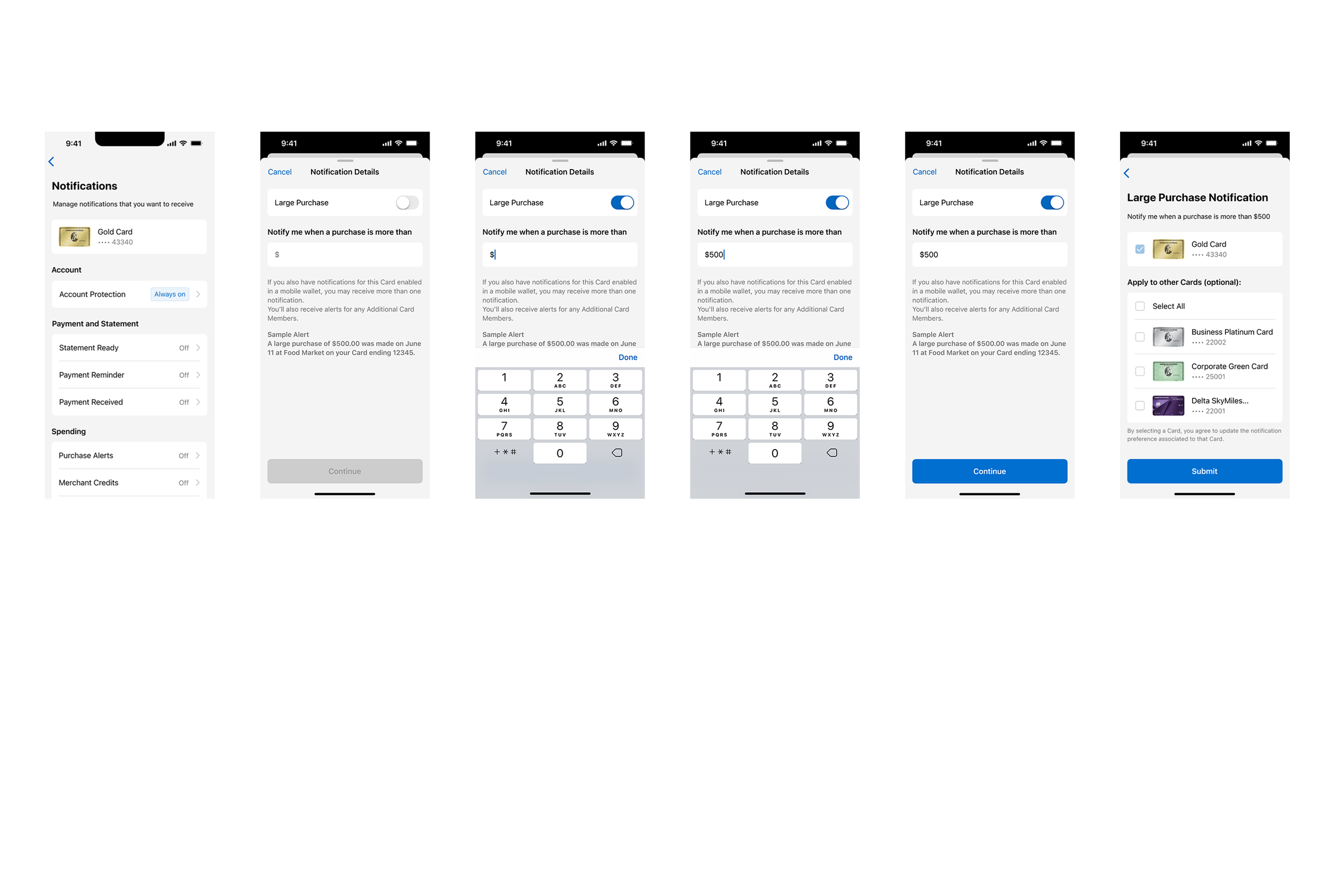
Complete UI uplift
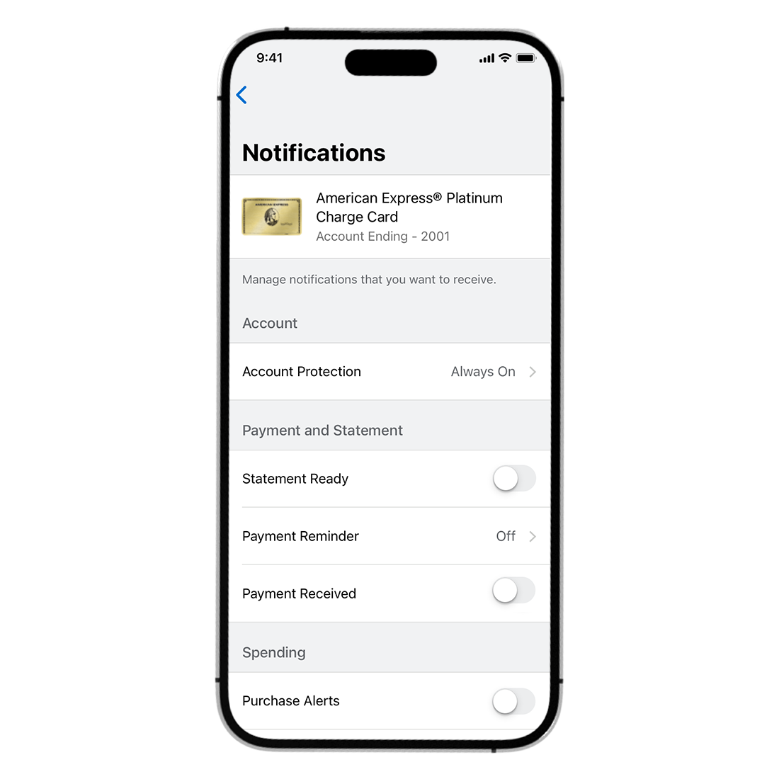

👆 Before user manually had to select all their cards, even the one they entered through

Improved experience
on Apply Screen
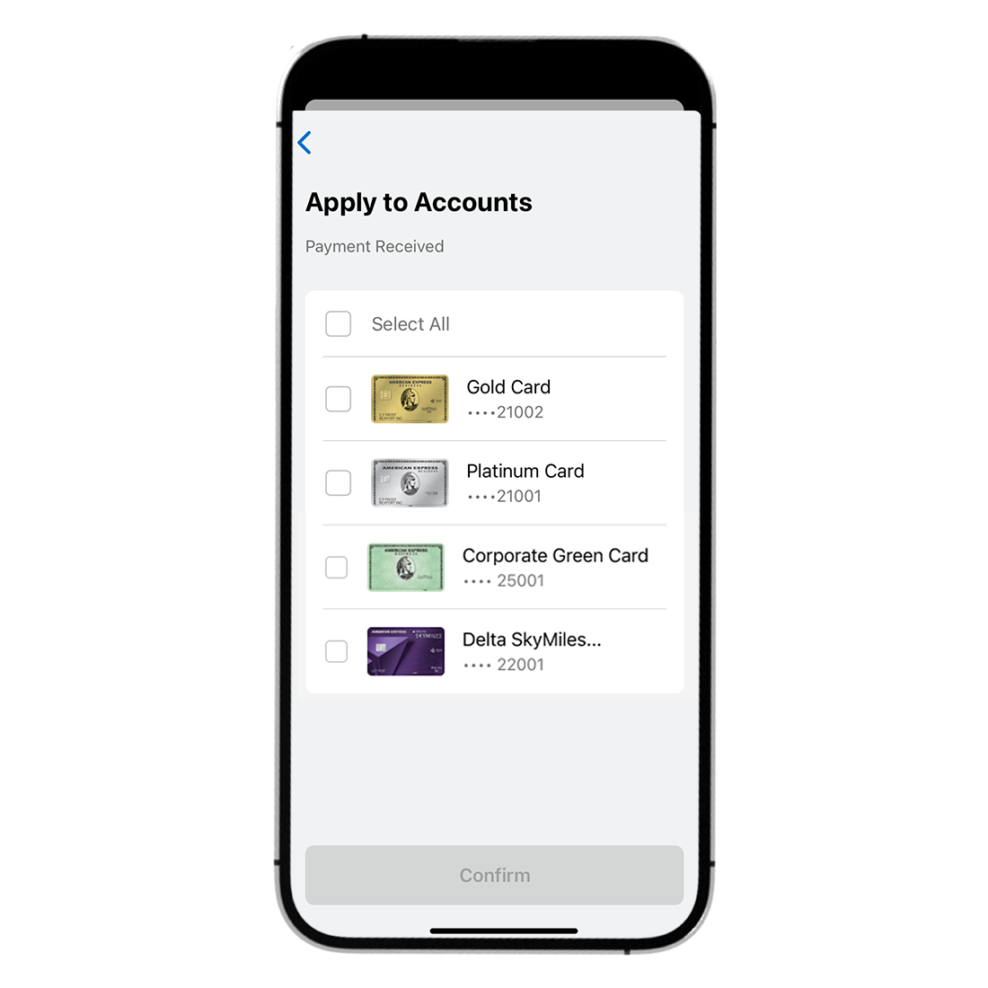
👆 In the New screen, the card is automatically selected, so user can add extra cards if they want to

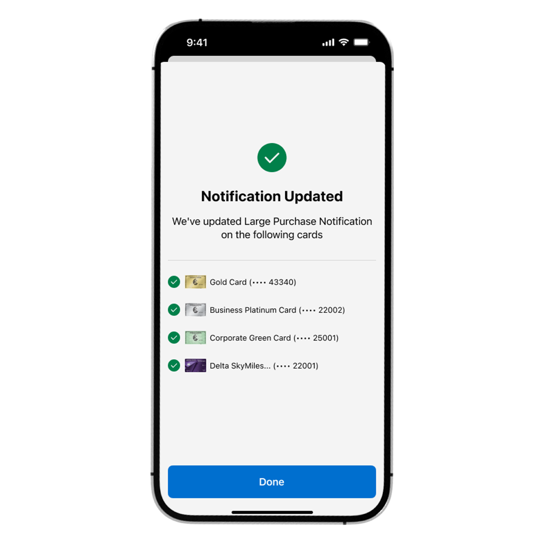
New confirmation screen


✦ Boom! This is the actual released now! ✦
✦ HIGLIGHTS ✦
The redesigned Notification screen became a more intuitive and high-utility space, contributing to improved app engagement overall. It now acts as a hub for timely, personalized interactions, reflecting Amex’s commitment to digital excellence.
✅ Drove Push Enrolments on the Mobile App
✅ Closed the gap of 41% of Multi-Card CM’s preferences enrolled for more than 1 Card to 70% of Overall Preferences enrolled
✅ Reduced overall SMS costs
✅ Increased Customer Satisfaction Score (CSAT) and Digital Engagement

⭐️ Launch the same Apply All and Confirmation Screens for Android in the next App release
⭐️ Extend Apply All capability to Push Preferences that were out of scope for MVP
⭐️ Discovery and internationalisation of more Push Preferences and capabilities for 2025
⭐️NEW Badge exploration
