✦ Project #1 ✦
PUSH NOTIFICATIONS UPLIFT
Modernise and solidify the notification enrolment experience for our Card Members, driving higher engagement through a full UI modernisation and interaction design
📱 IOS, Android 📆 2024-2025 ⏳ 6+ months 👨💻 Lead Designer


✦ THE EVOLUTION ✦
✧ 2023 and before ✧

✧ mid 2024 ✧

✧ late 2025 ✧

✦ BRIEF ✦
Despite a loyal user base, our app was facing a steep decline in engagement. Why? Users were missing critical notifications and deadlines, affecting both satisfaction and trust.
Digging into the issue, we discovered the root cause: a dated, fragmented push notification system that hadn’t been touched in years. It was riddled with usability issues. Users found it hard to navigate, nearly impossible to customise across multiple accounts, and - most critically - hard to even find.
✷ Engagement was dropping
✷ Users were missing critical updates
✷ The notification preferences screen was outdated, confusing, and barely usable
✷ Revenue loss on the Offers side
🏆 Objective
To redesign the Notification screen to increase engagement, usability, and consistency with the Amex brand with a the goal of drive revenue and reduce SMS costs.
🧨 Problem Statement
“The existing Notifications screen presents outdated UI patterns, lacks clear information hierarchy, and offers limited interactivity. As a result, user engagement remains low, and key communications are frequently overlooked, undermining both user experience and the effectiveness of timely messaging.”
✦ RESEARCH ✦
🔎 User Interviews
we conducted a rapid user lab with 6 Card Members (CMs) to evaluate the discoverability and usability of the current system. The findings were clear (and brutal 🥸):
✷ Users couldn’t locate notifications easily
✷ Once found, the interface was confusing and outdated
✷ Managing preferences across multiple cards was unclear and cumbersome
✷ The language used was inconsistent and often unclear
✦ WORKSHOP ✦
🤝 How Might We
“How might we create a Notification experience that is engaging and user-friendly, while aligning with Amex’s brand and industry standards?”

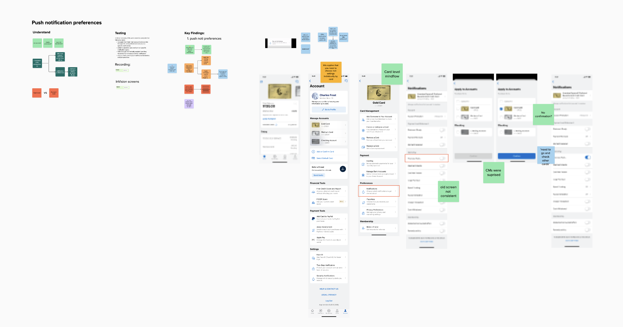


🤝 Design Goals
✷ Drive meaningful engagement
✷ Enable action from within notifications
✷ Clarify purpose and show value
✷ Improve readability and hierarchy
✷ Maintain accessibility standards
✦ DESIGN ✦
🎨 Much-Needed Overhaul
The legacy designs were stuck in Sketch. I led a complete rebuild of the experience in Figma.
This wasn’t just a visual update. It was a foundational re-architecture of the interaction model, information hierarchy, and design system usage. Key focuses included:
✷ A modern, mobile-friendly UI with clear grouping
✷ Simplified Notification setting process
✷ Improved accessibility and clear feedback states
before & after
✧
before & after ✧

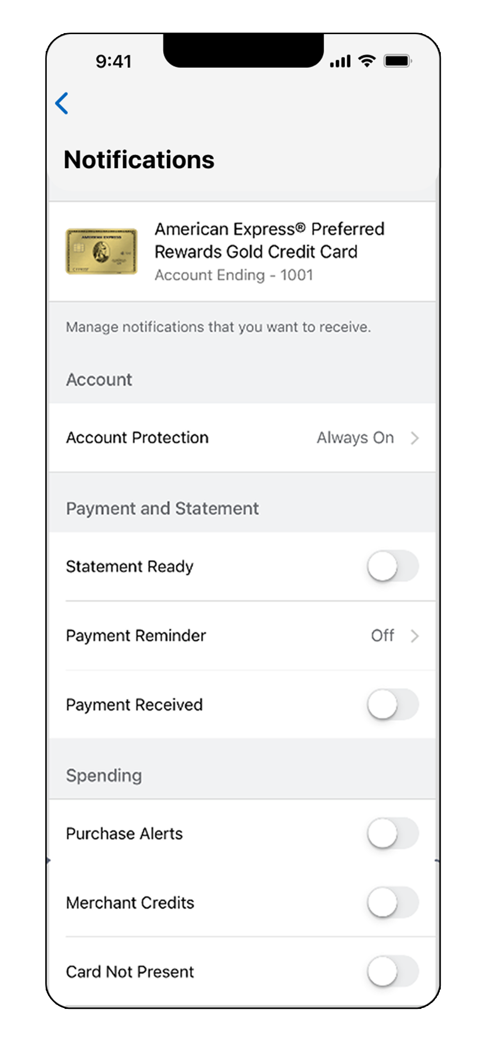
✦ BEFORE ✦
👎 1. Dated, inconsistent UI
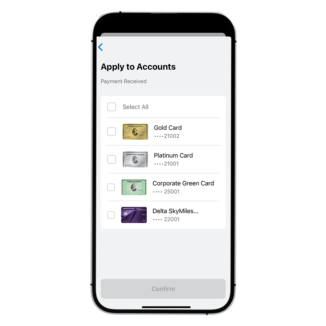
👎 2. Confusing “Apply to Accounts” screen
👎 3. Lack of clarity after applying changes
👎 4. Inconsistent UX copy
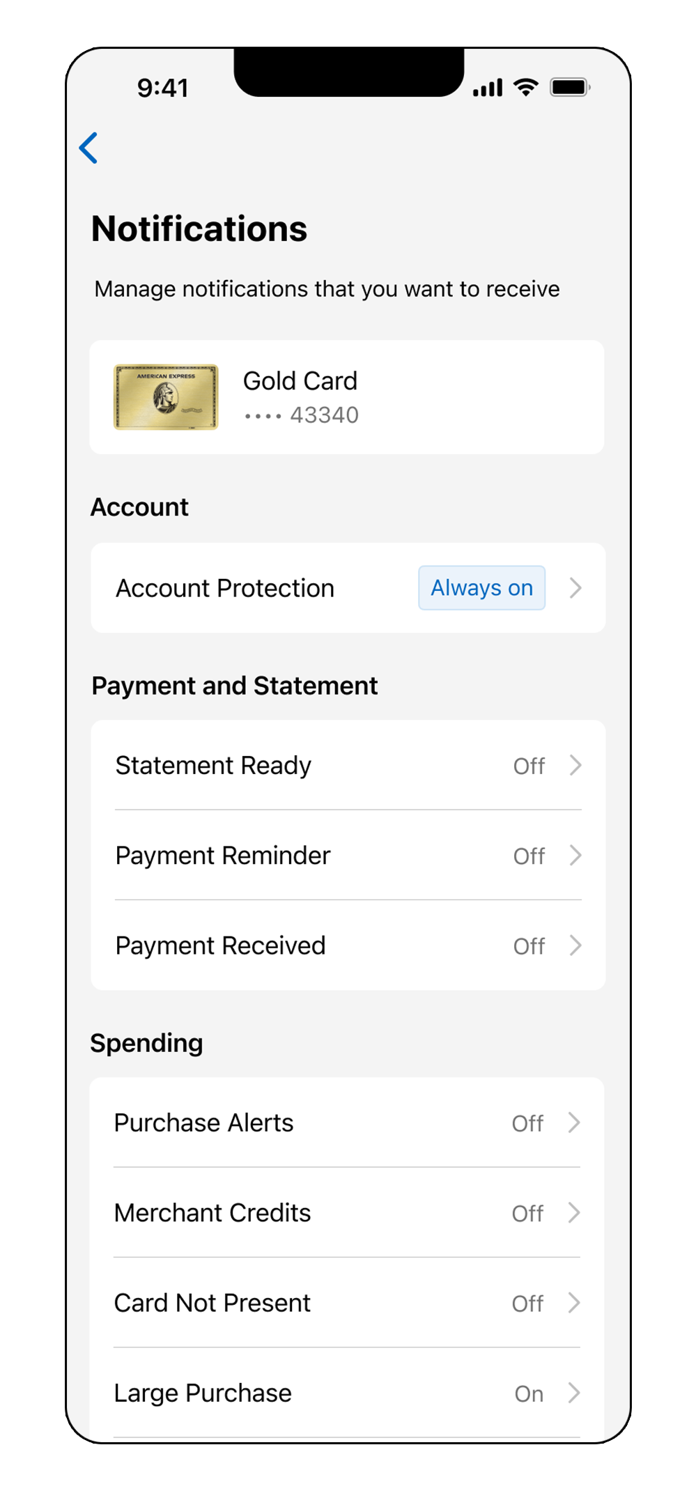
✦ AFTER ✦
✅ 1. Complete UI uplift, based on the latest NDL guidelines
✅ 2. Redesigned “Apply” screen based user feedback
✅ 3. Review UX copy for better understanding and navigation
✦ HIGLIGHTS ✦
Complete UI uplift
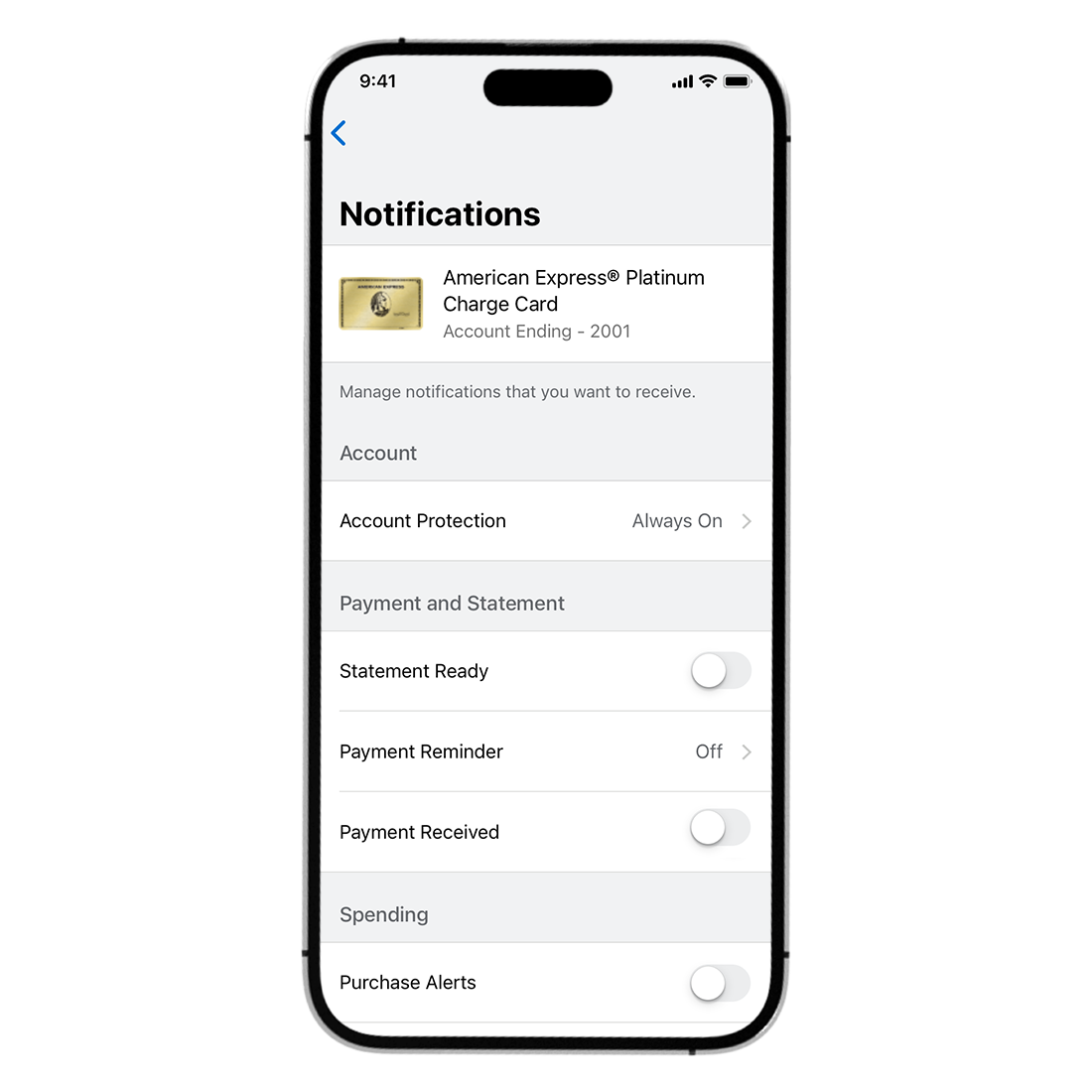
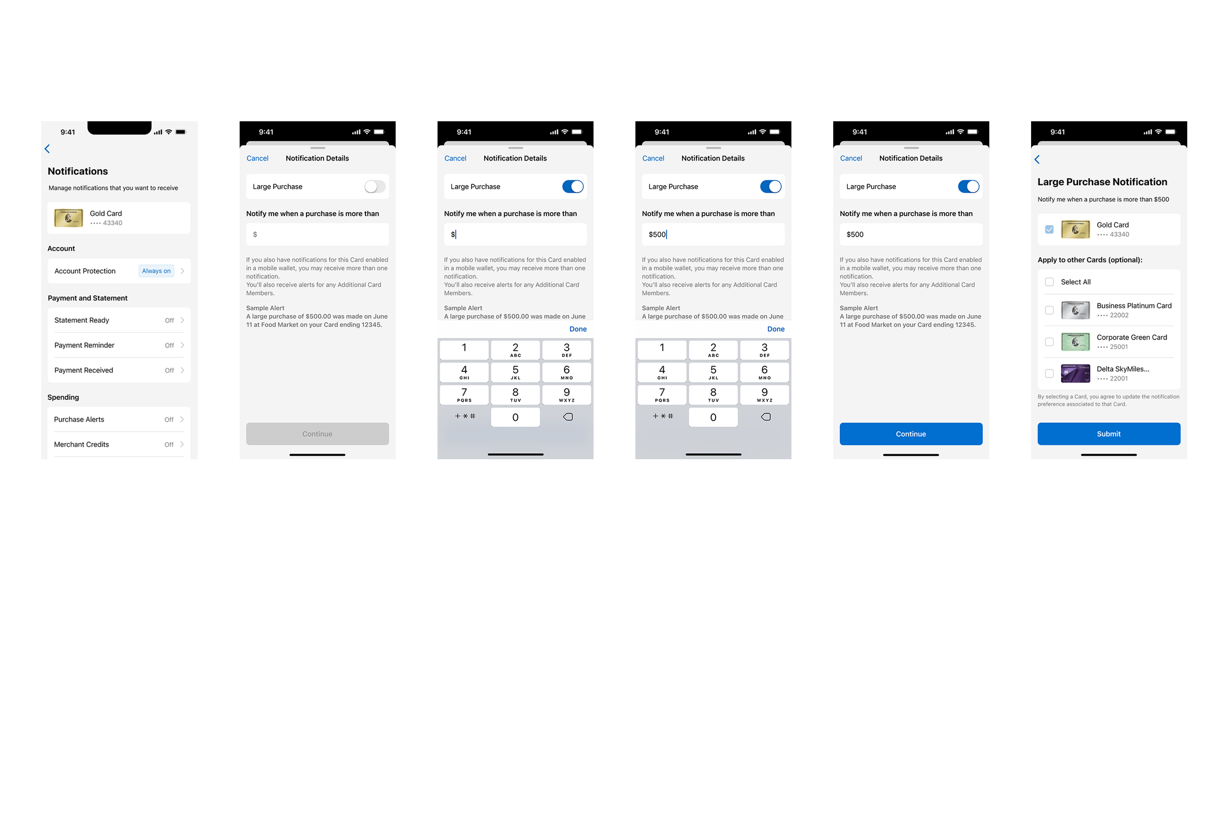
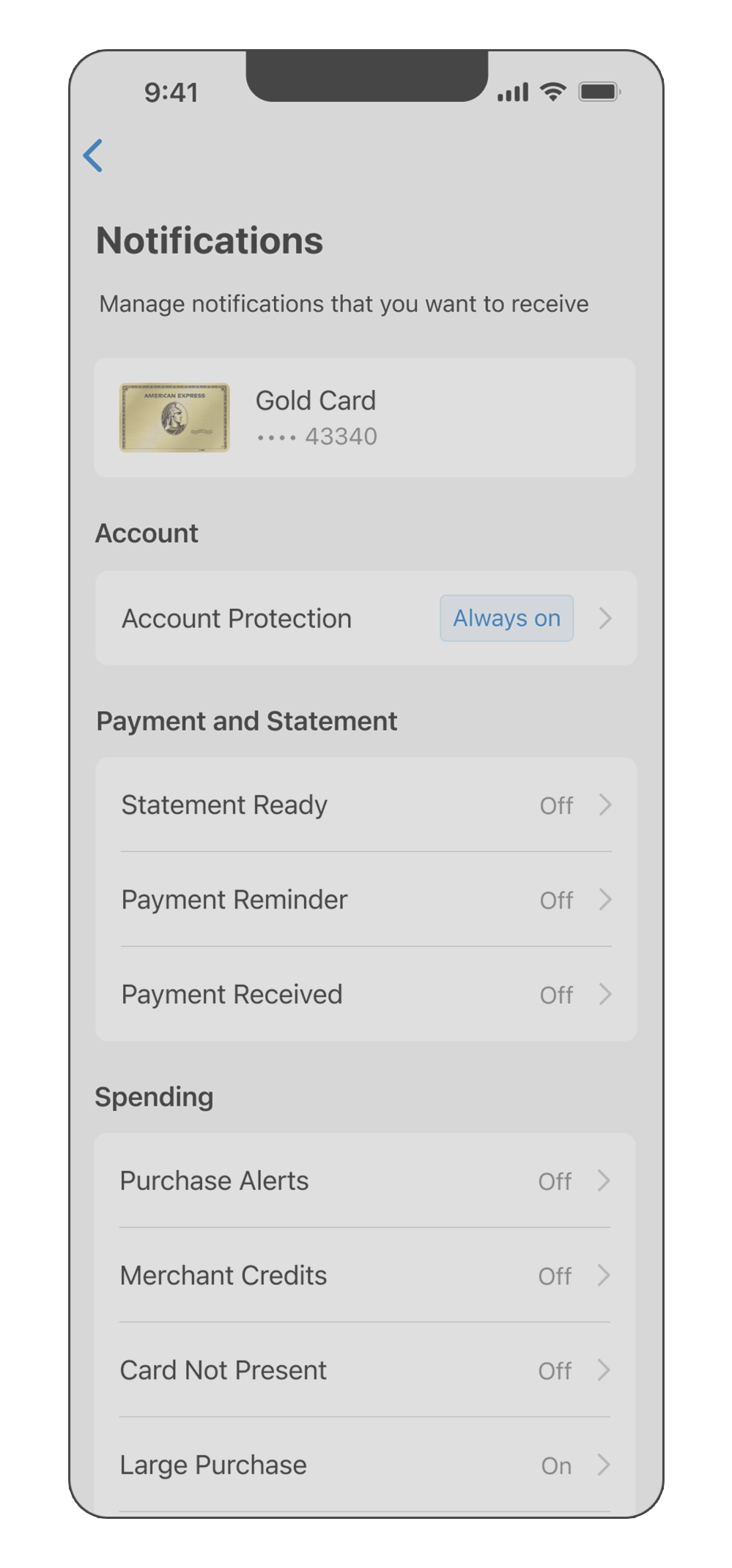
I rearchitected notification preferences, essentially rebuilding what existed from scratch using the latest, Swift UI.


👆 Before user manually had to select all their cards, even the one they entered through
👆 In the New screen, the card is automatically selected, so user can add extra cards if they want to
Improved experience
on Apply Screen

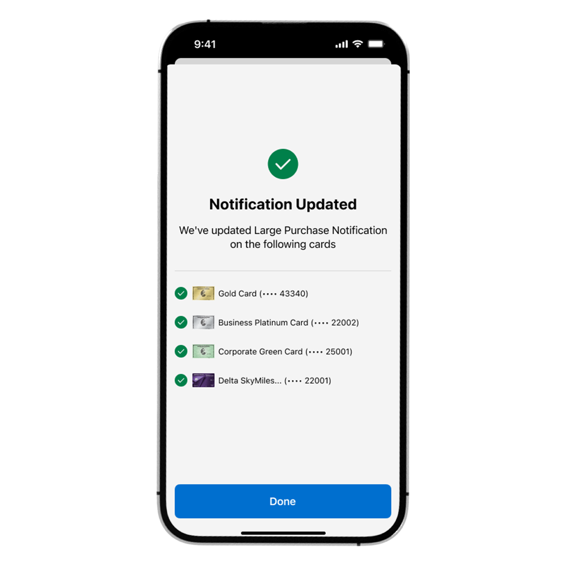
New confirmation screen
We've introduced the Confirmation Screen for ALL Push Preferences to 100% of the US population
Card Members will now have a confirmation screen to ensure clarity of successful Push Notification Preference updates.
📱 Single Card Users
📱 Multi-Card Users (Apply to all eligible cards)


✦ Boom! This is released now for real! ✦
✦ OUTCOME ✦
We implemented robust Adobe Analytics tagging to track Push Enrolment performance within the App ☀️
The new experience - according to numbers - became more intuitive and high-utility, contributing to improved app engagement overall. It now acts as a hub for timely, personalised interactions, reflecting Amex’s commitment to digital excellence.

✅ Push enrolments on the Mobile App grew significantly: 41% of multi-card Cardmembers enrolled for more than one card, contributing to an overall 71% enrolment rate for preferences.
✅ Reduced overall SMS costs
✅ Increased Customer Satisfaction Score (CSAT) and Digital Engagement
✦ NEXT STEPS ✦
⭐️ Launch the same Apply All and Confirmation Screens for Android in the next App release for all markets
⭐️ Extend Apply All capability to Push Preferences that were out of scope for MVP
⭐️ Discovery and internationalisation of more Push Preferences and capabilities for 2025
Later this year….
⭐️ Test NEW Notifications Screen then ramp-up the winning variant to 100% of the US Market (after experiment results)
⭐️NEW shimmering badge exploration 👇
Testing the newest screen!
Included in our new App Release is the NEW Push IA experiment for the US Market!
For the longest time, the Push Preferences space has just been a long list our customers have to scroll through, and that list will continue to grow. We are now implementing a more robust information architecture in the Push space for customers to easily navigate through and where all Push Preferences can easily be found.
Old screen
New screen
🤝 Why
✷ Establish a strong foundation for an ever-growing list of Push Preferences
✷ Reduce the amount of scrolling in the space
✷ Increase overall Push engagement: Further improve Net Start Rate and Net Conversion Rates
✷ Create a fun and inviting space for customers
✷ Allow for future deeplinking to whole Push categories instead of single Push Preferences
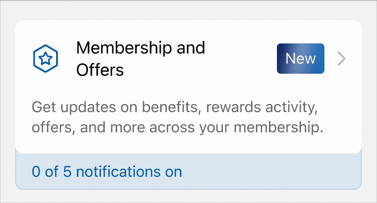
Created a new badge for the Membership and Offers category to highlight the increasing number of notifications in this section 🎖️
